
Sign Up For Free Tips So You Can:
The Psychology of Colour in Email Design and Conversion
Colour is one of the first signals people process when they open an email. Before a subscriber reads the subject line, scans the offer or understands the call to action, the palette has already created an impression about trust, urgency, quality and relevance.
Effective email colour psychology is less about choosing a universally “perfect” hue and more about creating visual meaning. The right combination can guide attention, make an offer feel credible and help a busy reader decide what to do next.
Colour Shapes Attention Before Copy
Subscribers rarely read marketing emails from top to bottom. They skim on a phone, look for familiar branding and decide within seconds whether the message deserves attention. Strong contrast between the background, headline and button gives the eye a clear route through the email.
Bright colours can attract attention, but intensity needs control. A vivid orange button may work well against a calm navy layout, while several competing bright elements make the message feel noisy. Use saturation strategically so the primary action carries more visual weight than secondary links.
Colour also affects perceived effort. A clean white or lightly tinted background can make an email feel simple and accessible. Darker blocks can create a premium mood, particularly for technology, finance or high-value services, provided text remains easy to read.
What Colours Signal In The Inbox
Blue often communicates reliability and calm, which helps brands selling software, professional services or financial products. Green can suggest growth, freshness or progress, while red may create urgency or highlight a limited opportunity. Yellow can feel energetic and optimistic, though large areas may reduce legibility.
These associations are flexible rather than fixed rules. A luxury brand may use muted charcoal and cream to imply refinement, while a children’s retailer might use lively primary colours. The surrounding design, product category and audience expectations shape how each colour is interpreted.
Cultural context matters as well. Australian customers may respond differently to a polished local service email than to an aggressively urgent overseas promotion. Familiar language, transparent pricing in Australian dollars and a trustworthy visual identity can make colour choices feel more believable.
Match Hue To The Conversion Goal
Start with the action you want the subscriber to take. A welcome email may benefit from a friendly, energetic palette that encourages exploration. A cart recovery message needs clarity and reassurance, while a webinar reminder should make the date, time and registration button easy to find.
Use one dominant brand colour, one supporting colour and one action colour. The action colour should stand apart from the rest of the design, but it still needs to belong to the brand. When every element uses a different accent, subscribers cannot tell which action matters most.
For marketers building a sequence from a free resource to a paid offer, the visual system should evolve gradually. A practical value ladder guide can help connect early trust-building emails with later sales messages without making the transition feel abrupt.
Compare Palette Choices With Purpose
The best palette depends on the emotional job your email must perform. Rather than selecting colours because they look attractive in a design tool, assess their likely effect on attention, confidence and action.
| Palette Direction | Likely Impression | Useful For | Watch For |
|---|---|---|---|
| Navy, white and teal | Trustworthy and professional | Finance, SaaS and consulting | Can feel cold without warmer accents |
| Green, cream and charcoal | Natural, balanced and reassuring | Health, sustainability and food | Green claims may appear generic |
| Orange, navy and white | Energetic and action-focused | Promotions, events and retail | Orange can overwhelm small screens |
| Black, cream and gold | Premium and exclusive | Luxury goods and high-ticket services | Low contrast can harm readability |
| Purple, coral and soft grey | Creative and expressive | Coaching, beauty and digital products | May clash with conservative categories |
Test the palette in the actual email client, not just in a design preview. Gmail, Outlook and mobile apps can render colours differently, and dark mode may invert or alter the visual hierarchy.
Design For Australian Readers
Australian audiences are highly mobile-oriented, so buttons and colour contrasts need to work on smaller screens while someone is commuting through Sydney, waiting for a tram in Melbourne or checking messages during an afternoon break. A button that looks prominent on a laptop may disappear into the layout on a phone.
Timing and context matter too. A campaign for an Australian retailer may need to account for Australian Eastern, Central and Western time zones, local public holidays and the end-of-financial-year buying period. Colour can reinforce those moments, but seasonal accents should never overpower the offer itself.
Use plain, familiar wording alongside the design. “Shop now”, “See the offer” and “Grab your spot” may sound more natural for some Australian brands than highly formal alternatives. If using red to signal urgency, support it with an honest deadline rather than relying on visual pressure.
Accessibility is essential across every market. Check colour contrast, avoid using colour as the only way to communicate status and include descriptive text for important graphics. This supports subscribers with visual impairments and improves clarity when images are blocked.
Build A Repeatable Email Palette
A consistent palette makes every message easier to recognise. Document the role of each colour rather than recording only its hex code, so writers and designers can make decisions quickly across newsletters, automated sequences and promotional campaigns.
A useful brand system may include:
- A background colour for calm, readable space
- A text colour with strong contrast
- A brand colour for headers and visual identity
- An action colour reserved for important buttons
Before sending, review the email from the subscriber’s point of view. Ask whether the main benefit is easy to find, whether the button looks clickable and whether the design still works without images.
A practical pre-send check includes:
- Previewing light mode and dark mode
- Testing Gmail and Outlook rendering
- Viewing the message on a small mobile screen
- Checking contrast and link visibility
Track performance with controlled experiments. Compare one button colour at a time while keeping the subject line, offer, audience and send time as consistent as possible. Measure clicks, completed conversions and revenue rather than opens alone, since privacy changes have made open-rate data less dependable.
Connect Colour With The Full Funnel
Colour influences conversion, but it cannot repair a weak offer or confusing message. The promise in the subject line, the benefit-led copy, the landing page and the checkout experience should all feel like parts of the same journey.
A subscriber who clicks a coral button and lands on a page dominated by unrelated black-and-green branding may hesitate. Carry key visual cues through the funnel so the transition feels expected. Consistency reduces friction and strengthens recall.
Use Marketing Cipher for practical guidance on copywriting, consumer psychology, email marketing and conversion strategy. Then apply those principles to your own audience data, because the most persuasive palette is the one that helps your specific customers understand and trust the next step.
Choose a primary action in your next campaign, assign it a distinctive but accessible colour and test the result against your current design. Give the experiment enough traffic to produce meaningful evidence, then use what you learn to refine future emails and turn visual attention into measurable sales.
Expert Marketing Tips & Tricks
We will share with you the latest tips and tricks from proven marketing experts:
- Dominate your target market
- Write powerful sales copy that converts
- Learn traffic secrets to attract unlimited leads
- Create Irresistible offers
- Grow your email list
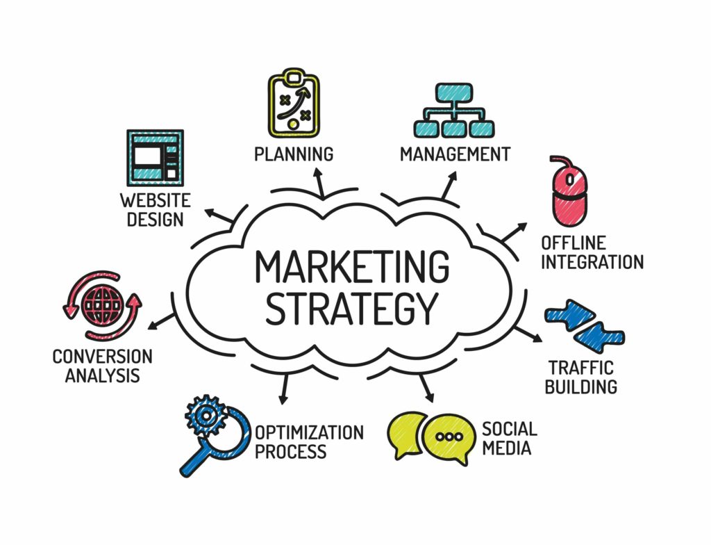
Get FREE Marketing Tips So You Can Grow Your Online Business
Check Out Our Latest Posts
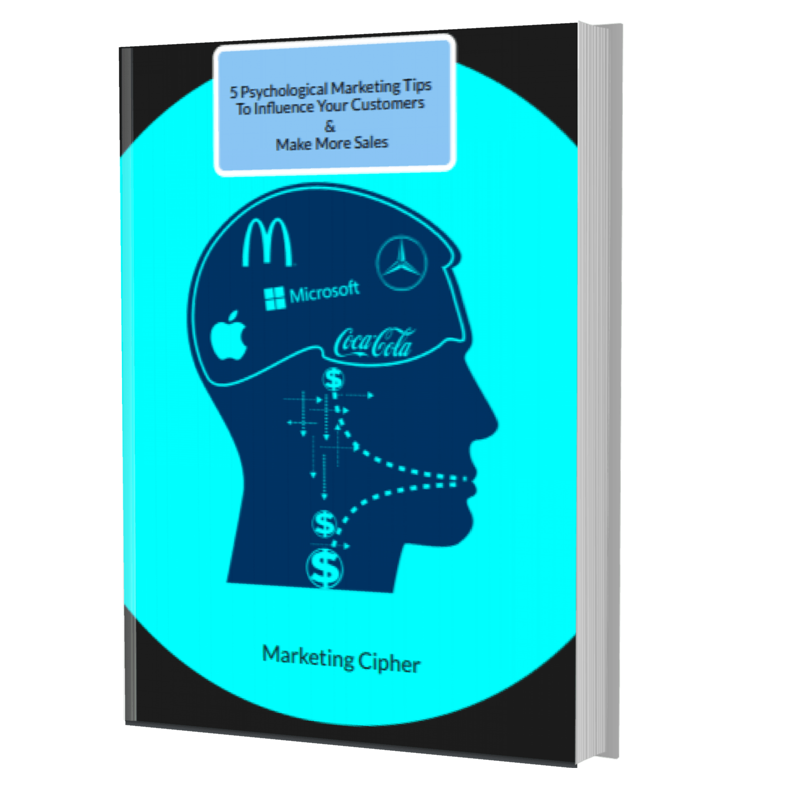
Get Your FREE Gift
"5 Psychological Marketing Tips To Influence Your Customers & Make More Sales"
Download This Free e-book To Learn How To:
Want More Leads, Traffic, & Sales?
Sign Up For Free Tips & Boost Your Results Now!