
Sign Up For Free Tips So You Can:
The Psychology of Color in Email Marketing Buttons
Every element in an email competes for attention, but the call-to-action button carries the greatest responsibility. Its color can influence whether subscribers notice it, understand its purpose, and feel ready to click. A well-chosen shade supports the message; a careless one can make an otherwise persuasive offer feel confusing or untrustworthy.
Color does not work as a universal conversion shortcut. A red button will not automatically outperform a green button, and a blue button will not guarantee confidence. Results depend on audience expectations, brand identity, surrounding design, offer type, and the emotional state created by the email copy.
The most effective approach treats button color as part of a larger persuasion system. Copy, contrast, spacing, visual hierarchy, and timing all shape how a recipient interprets the action. Understanding these factors makes testing more meaningful and helps marketers create emails that generate qualified clicks rather than empty engagement.
Color Shapes First Impressions
Subscribers often scan an email before they read it. A distinctive button color can create a visual stopping point, directing the eye toward the intended action. This is especially valuable in promotional emails where the reader may spend only a few seconds deciding whether the message deserves attention.
Color also communicates mood. Warm tones can suggest energy and urgency, while cooler tones often feel calmer and more dependable. These associations are learned through culture, personal experience, and repeated exposure to familiar interfaces, so they should guide strategy rather than dictate it.
A financial newsletter may benefit from a restrained blue or navy button that reinforces security. A limited-time fashion offer might use coral or orange to convey energy. The important question is whether the button’s visual personality fits the promise made by the email.
Match Button Color To Subscriber Intent
The best choice depends on what the recipient is being asked to do. A low-friction action such as reading an article may need a softer, less aggressive treatment. A purchase, registration, or deadline-driven offer may require stronger visual emphasis and a more energetic color.
Brand consistency matters because subscribers build mental shortcuts over time. If every email uses a different button color, recipients may need to relearn which element is clickable. Consistent visual cues can make the action easier to recognize, especially for audiences receiving frequent campaigns from the same company.
This does not mean every button must look identical. A brand can establish a core palette while adapting brightness, saturation, or secondary colors to match different campaigns. Marketing education resources such as Marketing Cipher can help connect these design choices with broader conversion and consumer psychology principles.
Contrast Determines Whether Color Works
A psychologically appropriate color is useless if the button blends into its background. Contrast affects visibility, readability, and perceived importance. A pale yellow button on a white email may feel cheerful, yet many subscribers will struggle to find it or read the text.
Strong contrast should exist between the button and the surrounding area, as well as between the button background and its label. Dark text can work well on lighter shades, while white text usually needs a sufficiently dark or saturated background. Accessibility tools and contrast checkers can identify problems before a campaign is sent.
The button should also stand apart from nearby links, images, and decorative elements. Clear spacing gives the eye room to process the action. When contrast and whitespace work together, the color becomes a directional signal instead of visual noise.
| Button color family | Common emotional cue | Useful email context | Potential concern |
|---|---|---|---|
| Blue or navy | Trust, stability, confidence | SaaS, finance, education | May feel passive for urgent offers |
| Green | Progress, ease, positive action | Sign-ups, savings, confirmations | Can blend into nature-themed designs |
| Orange | Energy, friendliness, enthusiasm | Promotions, content downloads | May appear overly casual for luxury brands |
| Red | Urgency, power, importance | Deadlines, clearance sales | Can create pressure or alarm |
| Purple | Creativity, premium appeal | Beauty, lifestyle, exclusive content | May reduce clarity when heavily stylized |
| Yellow | Optimism, attention, warmth | Cheerful promotions, simple actions | Often needs dark text and strong contrast |
Emotional Associations Need Context
Color meaning changes according to the words around it. A red button labeled “Claim your reward” can feel exciting, while the same color beside “Resolve payment issue” may feel threatening. The copy gives the shade a narrative, and subscribers interpret both elements together.
Images and overall palette matter as well. A green button inside an email dominated by green photographs may disappear, while a red button in an otherwise neutral layout may become the strongest visual cue. Effective email design considers the relationship between the button and every nearby element.
Cultural expectations and audience demographics can affect interpretation. Testing with a specific subscriber segment is more reliable than applying broad claims about color psychology. A button that performs well for new prospects may produce a different response among loyal customers who already understand the brand.
Test Behavior Instead Of Assumptions
A/B testing can reveal whether color changes actually influence performance. Keep the button copy, placement, offer, audience, and email subject as consistent as possible while changing only the color. This isolates the variable and makes the result easier to interpret.
Track more than the click-through rate. A brighter button may attract additional clicks but produce fewer purchases if it creates curiosity without matching the offer. Monitor downstream metrics such as landing-page engagement, registrations, revenue per recipient, and unsubscribe rates.
Testing should continue long enough to gather meaningful data and should account for device differences. A color that looks balanced on a desktop monitor may appear less distinct on a mobile screen. Reviewing email previews across devices can prevent design decisions based on a single display.
Practical Guidelines For Better Button Choices
Use these principles when selecting or reviewing a call-to-action color:
- Prioritize readable text and strong contrast over trendy palettes.
- Match the color’s emotional tone to the offer and subscriber intent.
- Reserve the strongest accent color for the primary action.
- Keep core button styling recognizable across recurring campaigns.
- Test clicks alongside conversions, revenue, and post-click behavior.
Color should support a clear value proposition rather than compensate for vague copy. “Download the guide” tells the reader what will happen, while “Get the free conversion guide” adds a reason to act. When the label is specific, the color can reinforce the decision instead of carrying the entire persuasive burden.
A focused email usually benefits from one dominant CTA. Multiple buttons in competing colors can dilute attention and make the hierarchy unclear. If several actions are necessary, use a primary color for the preferred path and a quieter text link or secondary style for optional actions.
The psychology of color in email marketing buttons is most useful when treated as a testable design discipline. Choose a shade that fits the brand, creates enough contrast, and supports the emotional promise of the message. Then measure what subscribers do after they click.
Apply these principles to your next campaign, compare the results against a controlled variation, and use the winning combination to refine future emails. A thoughtful button can turn attention into action—and action into measurable growth.
Expert Marketing Tips & Tricks
We will share with you the latest tips and tricks from proven marketing experts:
- Dominate your target market
- Write powerful sales copy that converts
- Learn traffic secrets to attract unlimited leads
- Create Irresistible offers
- Grow your email list
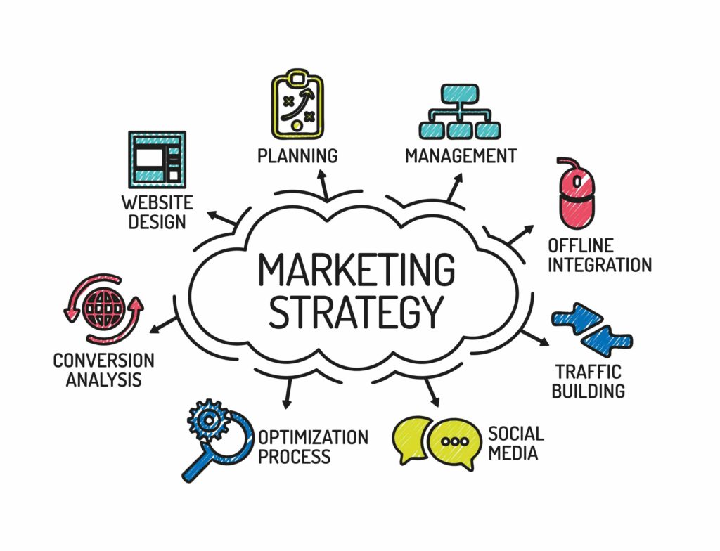
Get FREE Marketing Tips So You Can Grow Your Online Business
Check Out Our Latest Posts
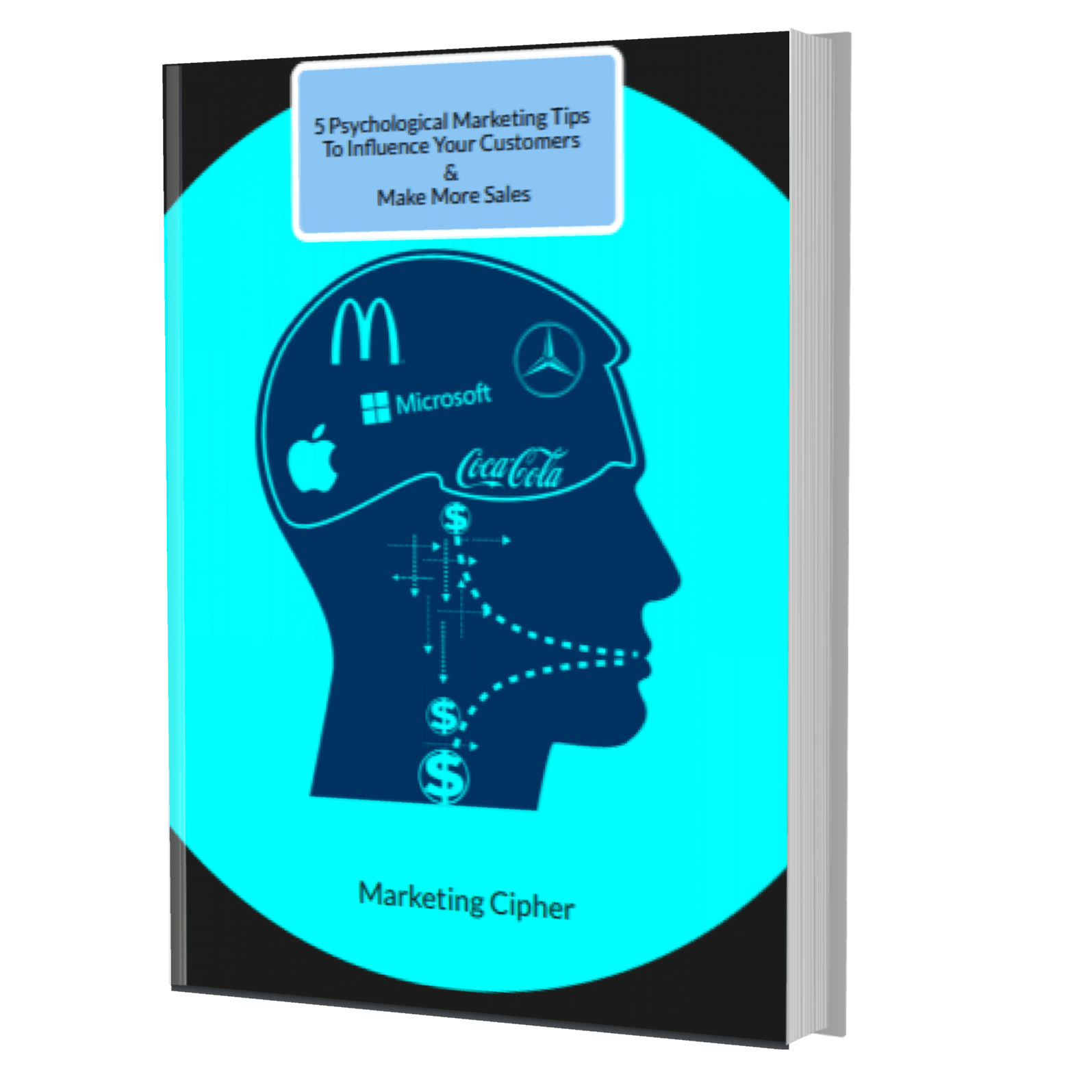
Get Your FREE Gift
"5 Psychological Marketing Tips To Influence Your Customers & Make More Sales"
Download This Free e-book To Learn How To:
Want More Leads, Traffic, & Sales?
Sign Up For Free Tips & Boost Your Results Now!