
Sign Up For Free Tips So You Can:
Make Your Call To Action Impossible To Miss
A call-to-action competes with every other visual and written element on a page. If its colour, wording, position and surrounding design blend into the layout, visitors may understand the offer but still fail to act. Strategic contrast gives the CTA a clear visual role and helps direct attention towards the next step.
Using contrasting elements to make your call-to-action stand out involves more than choosing a bright button colour. Effective contrast can appear in size, spacing, language, shape, urgency, imagery and even the difference between a visitor’s current situation and the result your offer promises. When these contrasts work together, the path from interest to conversion feels easier to follow.
Create a clear visual focal point
Colour contrast is often the fastest way to separate a CTA from the rest of a page. A button in a deep navy layout might use a warm orange, while a white page could support a saturated blue or green. The colour should fit the brand and remain readable, rather than appearing like an unrelated warning signal.
Use contrast sparingly so the action remains distinctive. If every card, link and icon uses a competing accent colour, the button loses its priority. Supporting elements can use lighter tints, outlines or muted shades, allowing the primary CTA to become the strongest visual cue.
Size and whitespace matter just as much. A generously padded button with a short label is easier to scan on a mobile screen than a cramped line of text. Extra space around the button creates separation from nearby links, especially for Australian visitors browsing on a phone during a commute through Sydney or Melbourne.
Contrast the message with the customer’s problem
Persuasive CTA copy creates a useful tension between the visitor’s current frustration and the outcome they want. “Download the checklist” is clear, but “Fix Your Landing Page” may feel more relevant when the audience is struggling with weak conversions. Strong verbs make the benefit easier to recognise at a glance.
Contrast can also reduce perceived effort. “Start my free trial” gives the action a personal, low-risk tone, while “Create an account” sounds more administrative. Match the wording to the stage of the buyer journey and avoid promising an outcome the offer cannot deliver.
For affiliate marketers, the CTA should support the evidence around it rather than interrupting the reader. A helpful product review guide can show how specific claims, proof and action language work together without making the recommendation feel forced.
Use layout and motion with restraint
A contrasting CTA should appear where motivation is highest. Place one near the key benefit, another after supporting proof and, for longer sales pages, a final button near the offer summary. Repeating the same primary action can improve usability, provided the page does not feel cluttered.
Directional cues can reinforce the button’s position. A short paragraph can lead naturally into the action, while an image, arrow or line of sight can guide attention towards it. Animation may help a new button attract notice, but constant pulsing or bouncing creates distraction and can reduce trust.
Accessibility should guide every design decision. Text must remain legible, focus states should be visible for keyboard users and buttons need enough space for accurate tapping. Test the CTA on common mobile widths, including devices used by customers shopping from Brisbane cafés or checking email during a train trip.
Make urgency credible and locally appropriate
Urgency is another form of contrast: the visitor compares acting now with delaying the decision. A genuine closing date, limited consultation availability or expiring bonus can support a clear CTA. Artificial countdown timers and exaggerated scarcity often create suspicion, especially when the same offer returns unchanged the next day.
Australian businesses also need to consider the Australian Consumer Law and guidance from the ACCC when presenting discounts, claims and availability statements. “Sale ends Sunday” should be accurate, and a “limited spots” message should reflect real capacity. Trust is a conversion asset, so the CTA should never depend on misleading pressure.
Local context can shape the offer language. Mentioning prices in Australian dollars, including GST information where relevant and showing delivery expectations for regional areas can remove uncertainty. A visitor is more likely to click when the button follows a transparent offer rather than forcing them to search for basic details.
Test contrast across the complete customer journey
A high-contrast button is not automatically a high-converting button. Track click-through rate, completed forms, purchases and assisted conversions rather than celebrating clicks alone. A vivid CTA may attract attention but produce poor-quality leads if the page makes an unclear promise.
Run focused A/B tests on one meaningful variable at a time. Compare benefit-led copy with action-led copy, a filled button with an outlined version, or a CTA above the fold with one placed after testimonials. Give the test enough traffic to produce useful evidence, and segment results by device, audience source and offer type.
Marketing education can help turn these observations into a repeatable process. Resources from Marketing Cipher cover copywriting, consumer psychology, email marketing and conversion strategy, giving businesses practical ways to connect design choices with commercial outcomes.
Practical ways to strengthen your CTA
Contrast works best when it serves a clear customer journey. Before changing a button from blue to red, check whether the offer is understandable, the benefit is believable and the next step feels proportionate to the visitor’s commitment.
Use the following recommendations as a practical review:
- Choose one primary CTA colour and reserve it for the most valuable action.
- Replace vague labels such as “Submit” with specific, benefit-focused wording.
- Surround the button with whitespace so it does not compete with nearby links.
- Add supporting proof, such as testimonials, guarantees or customer numbers, close to the CTA.
- Display Australian dollars, delivery details or GST information when they affect the decision.
- Test the button on mobile devices, slow connections and different screen sizes.
- Measure completed outcomes rather than relying on button clicks alone.
Review your highest-traffic landing page this week and identify the strongest source of contrast you can improve. Clarify the button copy, remove competing accents and test the revised version against a meaningful conversion goal. Then use the results to build a more consistent, trustworthy path from attention to action.
Expert Marketing Tips & Tricks
We will share with you the latest tips and tricks from proven marketing experts:
- Dominate your target market
- Write powerful sales copy that converts
- Learn traffic secrets to attract unlimited leads
- Create Irresistible offers
- Grow your email list
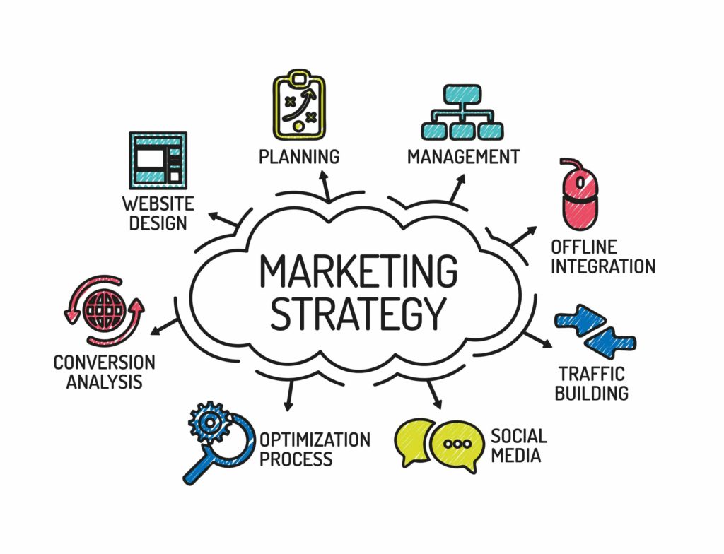
Get FREE Marketing Tips So You Can Grow Your Online Business
Check Out Our Latest Posts
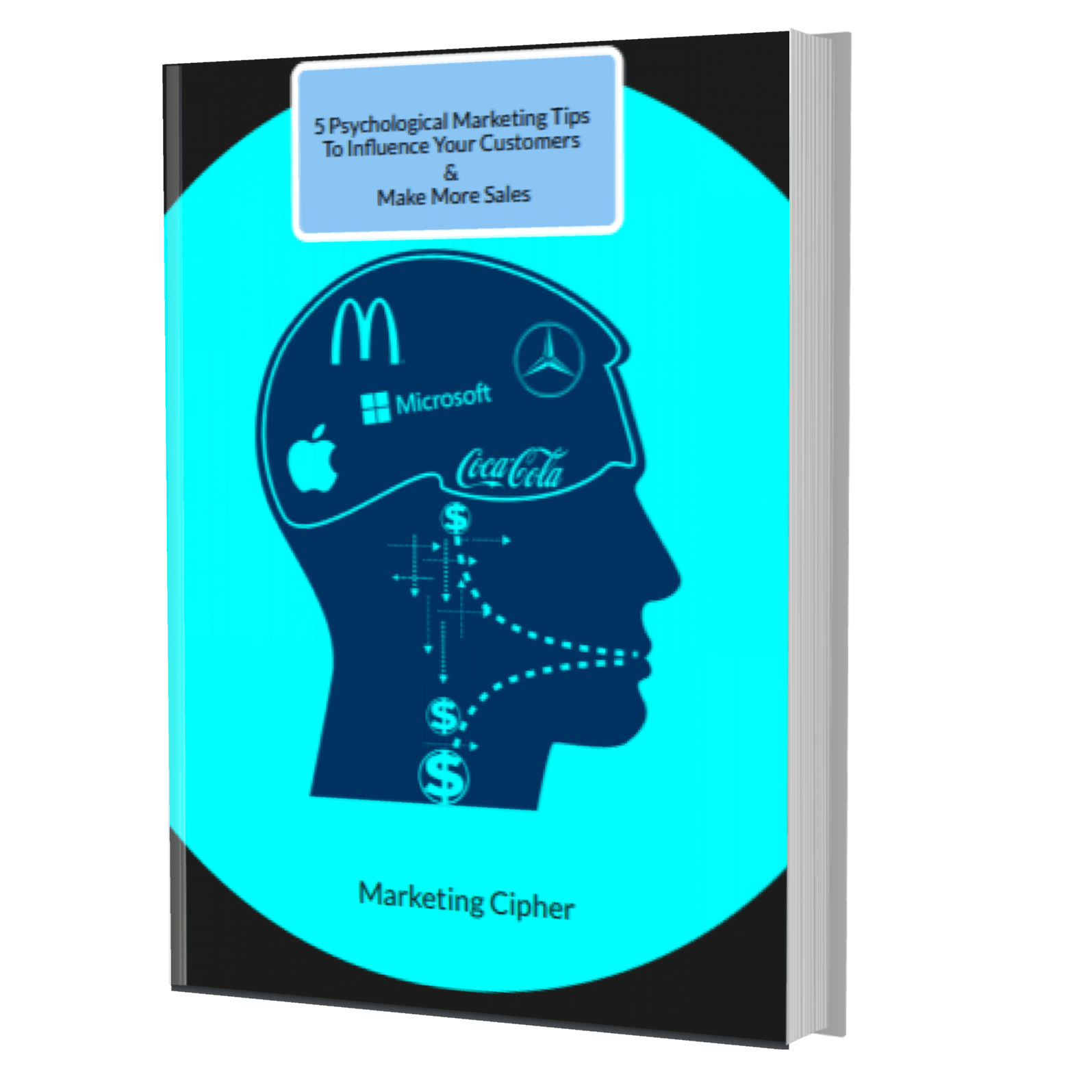
Get Your FREE Gift
"5 Psychological Marketing Tips To Influence Your Customers & Make More Sales"
Download This Free e-book To Learn How To:
Want More Leads, Traffic, & Sales?
Sign Up For Free Tips & Boost Your Results Now!