
Sign Up For Free Tips So You Can:
How to Structure a Bridge Page That Transitions From Free to Paid
A bridge page sits at the exact hinge between a free resource and a paid offer, and marketers who treat it as a throwaway squeeze page leave the most money behind. Visitors arrive from ads, blog posts, or podcast mentions, and the page has roughly thirty seconds to convert curiosity into an email address or a sale. Done well, the same page does both jobs in sequence, capturing the lead now and nudging toward a transaction through a thoughtful welcome email.
The challenge is sequencing. Pitch the paid offer too early and the reader bolts. Offer nothing beyond the freebie and your list stagnates at low-ticket sizes. Australian small business owners operate on tight margins, which makes the bridge page one of the highest-leverage assets in any funnel, since a small lift in conversion compounds across months of traffic.
What a Bridge Page Actually Does
A bridge page is a single-purpose landing page whose job is to move a reader from one state to the next, whether that means stranger to subscriber, subscriber to buyer, or freebie reader to course enrolment. Unlike a generic landing page, it references the prior step the reader just completed and uses that recognition as leverage.
In practice, this means the page acknowledges the free content that brought the visitor there. If the visitor downloaded a checklist on email subject lines, the bridge page should name that checklist above the fold. The bridge is built on familiarity, not novelty, which is why readers across Sydney, Melbourne, and Brisbane tend to respond better to pages that reflect their reality than to pages that pretend to reinvent it.
Mapping the Reader's Mental Shift
Every reader who lands on a bridge page is running a private calculation. They weigh whether the free resource gave them enough value, whether the paid offer is worth the price, and whether the brand behind the page is trustworthy. The bridge page has to answer all three questions in the order they arise, mirroring the reader's internal monologue rather than the marketer's pitch.
The first hurdle is value comparison, asking what the paid offer adds beyond the free resource. The second is risk, where refund guarantees and clear descriptions matter under Australian Consumer Law. The third is effort, covering how long the offer takes and what work is required. Address these in order and the reader feels guided. Skip straight to pricing and the reader feels processed.
The Free Side: Lead Magnet and Promise
The upper section of a bridge page should reinforce the promise of the free resource that brought the reader there. A common mistake is to bury the free offer under a long sales pitch, forcing the reader to scroll past persuasion before collecting what was promised. The free promise belongs in the headline, supported by a tight benefit stack of two or three bullets.
Below that, the page should describe what the reader gets immediately upon opting in. A comparison table works well here, since many readers prefer to scan rather than read. The table clarifies what is included in the free version versus what sits behind the paid tier.
| Element | Free Resource | Paid Offer |
|---|---|---|
| Format | PDF checklist or short video | Full workshop or cohort course |
| Access length | Lifetime download | 12 weeks plus live Q&A |
| Support | None | Email and community access |
| Typical price | $0 | $197 to $497 AUD |
| Best for | Testing a topic | Implementing a system |
The table does more than list features. It sets the reader's frame of reference, so the paid pitch further down feels like a logical upgrade rather than a surprise.
Crafting the Pivotal Transition
The pivot from free to paid is where most bridge pages fail. The transition works when it acknowledges that the free resource solved a small problem and then points to a larger one. A free checklist might solve what to write in a subject line, while the paid course solves how to build an entire welcome sequence that converts.
Transitional language should frame the paid offer as the next logical move, not a separate purchase. Sentences like "once you've worked through the checklist, you'll notice the next bottleneck" bridge the gap without a hard sell. Social proof carries the most weight in this section, and a short testimonial that mentions a specific result, such as a Brisbane-based freelancer who added three clients after taking the course, outperforms ten generic endorsements.
The Paid Offer Stack
Once the reader is mentally ready for the paid offer, describe it as a stack of value rather than a single price. List every component with a perceived dollar value, then reveal the actual price below. Put the most concrete deliverables first and the bonuses after, since order shapes perception.
The price reveal should sit inside a single, clear call to action button. Multiple CTAs on a bridge page dilute focus and lower conversion, because each button competes with the others for attention. Offers marketed to Australian consumers must also comply with the Australian Consumer Law, which means pricing in Australian dollars, clear refund terms, and honest descriptions. A short disclosure line near the price button keeps the page compliant and tends to lift conversion rather than hurt it.
Trust Signals and Local Compliance
Trust signals on a bridge page can be as simple as a logo strip, a short bio with a real photo, or a media mention. The signals should match the offer being made, so a premium offer needs premium signals while an entry-level offer can rely on lighter touches.
Local compliance matters as much as visuals. Any email collected on the page falls under the Spam Act 2003, enforced by ACMA, which requires consent, sender identification, and an easy unsubscribe path in every subsequent message. Storing those emails in line with the Privacy Act 1988 is also important for marketers handling customer data inside Australia. These details form the operational hygiene that separates a serious funnel from a fragile one in markets where consumer law is actively enforced.
Testing and Optimising the Path
Even a well-written bridge page will leave conversions on the table without testing. The two highest-leverage elements to test are the headline and the call to action button, since both shape first impression and final action. Secondary tests can include the order of the value stack, the inclusion of testimonials, and the length of the free offer description.
Tests should run for at least two weeks to account for the local rhythm of the Australian market, where B2B traffic dips across the Christmas to New Year break and picks up again in mid-to-late January. Sample sizes that look conclusive over a long weekend in Sydney can evaporate once full traffic resumes. Once the lead moves toward purchase, the follow-up email tactics after opt-in become part of the same conversion path.
Build Your Bridge This Week
The bridge page is the single most underused asset in most small business funnels, and the structure above can be implemented in a weekend. Start with a free resource that already pulls traffic, write the transition copy in plain language, and add a paid offer that genuinely extends the value rather than repeating it.
You can find more guides, templates, and the free ebook over at Marketing Cipher and map out the full funnel before your next campaign launches. Your free subscribers are already telling you what they want next, and a well-built bridge page is how you answer them.
Expert Marketing Tips & Tricks
We will share with you the latest tips and tricks from proven marketing experts:
- Dominate your target market
- Write powerful sales copy that converts
- Learn traffic secrets to attract unlimited leads
- Create Irresistible offers
- Grow your email list
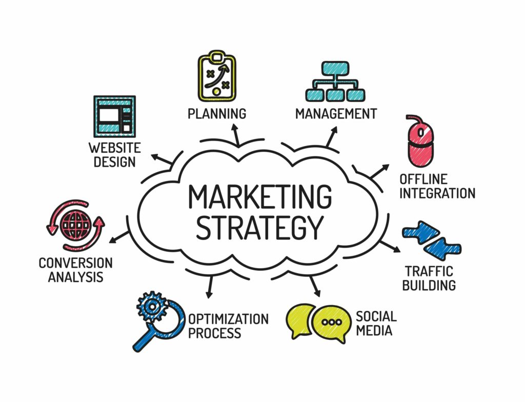
Get FREE Marketing Tips So You Can Grow Your Online Business
Check Out Our Latest Posts
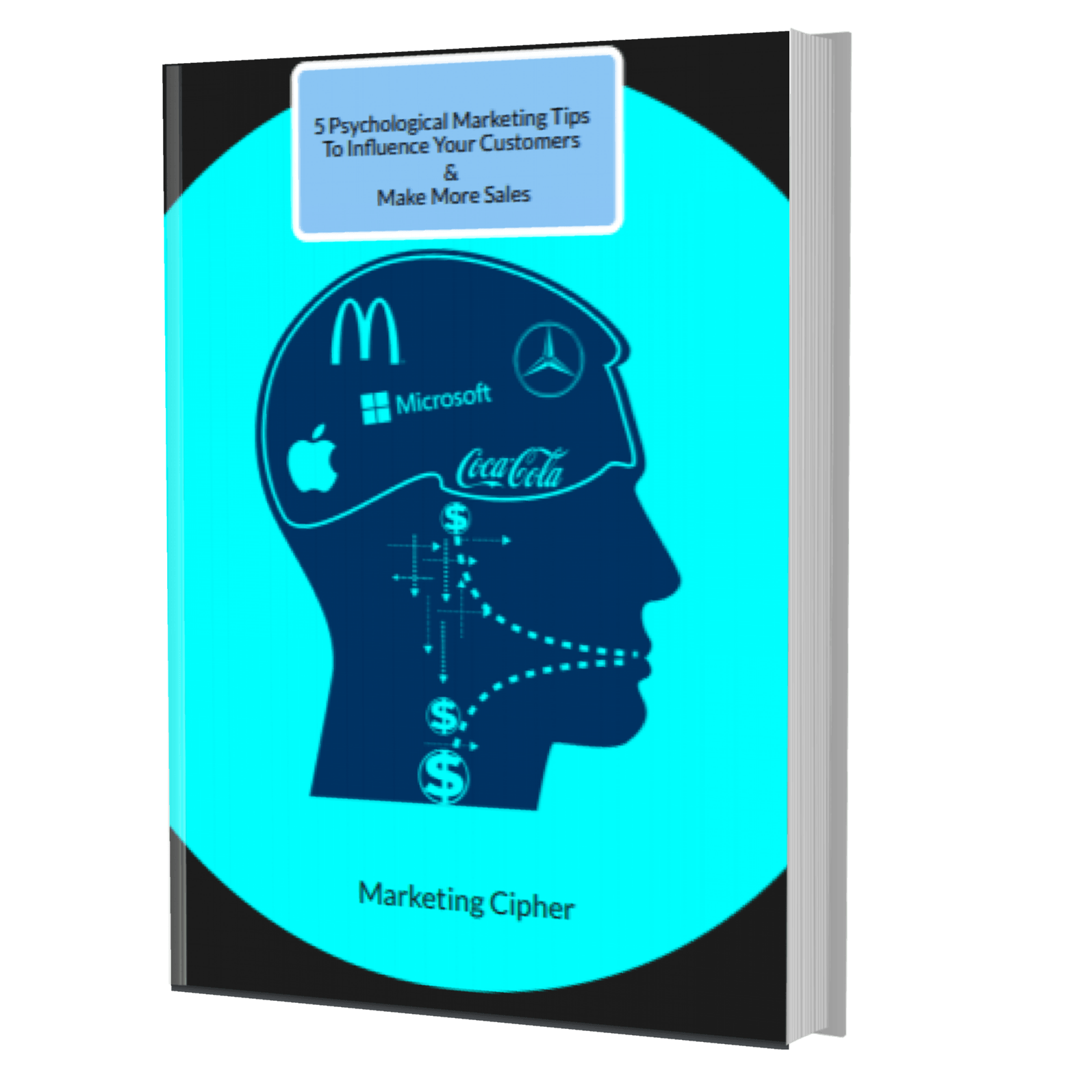
Get Your FREE Gift
"5 Psychological Marketing Tips To Influence Your Customers & Make More Sales"
Download This Free e-book To Learn How To:
Want More Leads, Traffic, & Sales?
Sign Up For Free Tips & Boost Your Results Now!