
Sign Up For Free Tips So You Can:
How to Structure a Landing Page That Converts on First Visit
A landing page has a narrow job: move a specific visitor toward one valuable action. That action might be joining an email list, requesting a quote, downloading an ebook, or purchasing an offer. When the page tries to serve several audiences or promote multiple outcomes, its message becomes difficult to follow.
A strong first-visit experience connects the visitor’s intent with a clear promise, credible evidence, and an easy next step. Every headline, image, button, and paragraph should support that path rather than compete for attention.
The most effective landing pages combine conversion copywriting, consumer psychology, and practical design. They answer the visitor’s main questions quickly: What is this? Is it relevant to me? Can I trust it? What should I do now?
Start With One Clear Promise
Before writing a headline, define the visitor, their immediate problem, and the result your offer provides. A useful value proposition is specific enough to feel personal and concrete enough to understand in seconds. “Improve your marketing” is vague; “Get 25 headline templates for writing higher-converting ads” gives the reader a recognizable benefit.
Place the core promise above the fold, alongside a supporting subheadline and primary call to action. The headline earns attention, the subheadline adds context, and the button identifies the next step. Keep the message aligned with the source that brought the visitor to the page, whether it was a search result, email, social post, or paid advertisement.
Build A Visual Path
Landing page structure should guide the eye in a deliberate sequence. Start with the promise, follow with benefits, address doubts, present proof, and finish with a clear decision point. A visitor should never have to search for the offer, its value, or the button that advances the process.
Use short sections, descriptive subheadings, generous spacing, and visual contrast around important elements. Images should explain or reinforce the offer rather than act as decoration. A product screenshot, result graphic, or preview of a digital resource often communicates more effectively than a generic stock photograph.
The page should also work as a coherent sales argument. For a deeper look at how persuasive elements fit together, study this guide to an affiliate sales page.
Match Proof To Visitor Risk
Proof is most persuasive when it answers the concern holding the visitor back. Testimonials can show outcomes, demonstrations can reduce uncertainty, guarantees can soften perceived risk, and recognizable client or media logos can establish credibility. Choose evidence based on the action you want the visitor to take.
Place proof near the claim it supports instead of hiding all testimonials at the bottom. A statement such as “Save hours each week” becomes stronger when followed by a short customer result, a workflow demonstration, or a specific before-and-after example.
| Visitor Concern | Useful Page Element | Best Placement |
|---|---|---|
| “Is this relevant to me?” | Audience-specific headline and benefits | Hero section |
| “Will this work?” | Testimonial, case study, or demonstration | Beside major claims |
| “What exactly do I receive?” | Offer breakdown or preview | Before the main CTA |
| “Can I trust this business?” | Credentials, guarantees, and contact details | Near the decision point |
| “What happens after I click?” | Clear button copy and next-step explanation | Directly beside the CTA |
Proof should be easy to verify and specific enough to sound real. “Great service” has little persuasive value; “Cut weekly reporting time from three hours to forty minutes” gives the visitor a concrete outcome to evaluate.
Write For Scanners And Intent
Most visitors scan before they read. Use a layered copy format that communicates the essentials through the headline, subheadings, bold benefits, captions, and button text. Someone who reads only those elements should still understand the offer and its primary advantage.
Translate features into outcomes. A feature describes what the offer contains, while a benefit explains why it matters. “Six email templates” becomes more compelling when framed as “Launch your next campaign without starting from a blank page.” Include enough detail to establish value, but remove sentences that repeat the same idea.
Use natural language that reflects the visitor’s own vocabulary. Search intent, ad wording, customer interviews, support conversations, and sales calls can reveal the terms people use when describing their problem. Matching that language makes the page feel relevant without forcing keywords into awkward copy.
Reduce Friction At The Decision
Every extra field, link, choice, or distraction can weaken conversion rate. Ask only for information necessary to deliver the promised value or complete the transaction. If an email address is sufficient for an ebook, do not request a phone number, company size, and job title without a clear reason.
Make the call to action specific and benefit-oriented. “Get the Free Checklist” is clearer than “Submit,” while “Start My Trial” creates more ownership than “Continue.” Repeat the primary CTA at sensible points on a long page, but keep its wording and destination consistent.
Remove unnecessary navigation when the campaign objective is focused. If visitors need reassurance, provide concise answers through an FAQ, guarantee, privacy statement, or delivery explanation. These elements reduce anxiety without sending people away from the conversion path.
Check The First-Visit Experience
A landing page may look persuasive on a desktop and still fail on mobile, load slowly, or create confusion after the click. Test the complete experience as a new visitor: open the page from the original traffic source, review it on a phone, complete the form, and confirm that the promised follow-up arrives.
Track more than the final conversion rate. Monitor scroll depth, button clicks, form-start rate, form-completion rate, bounce rate, and traffic-source performance. These signals help identify whether the problem lies in the message, page layout, offer, form, or follow-up sequence.
Conversion Checks Before Launch
Use a short pre-launch review to catch avoidable weaknesses:
- Confirm that the headline, ad, and offer make the same promise.
- Check that the primary CTA is visible, specific, and repeated appropriately.
- Replace vague benefits with concrete outcomes or examples.
- Test every form, button, link, confirmation page, and automated email.
- Review the page on mobile for speed, spacing, readability, and errors.
Run tests one meaningful variable at a time when possible. Changing the headline, form length, testimonial placement, and button color together may produce a different result, but it will not show which change created the improvement.
A high-performing landing page is built around visitor clarity. Define one audience and one action, make the value obvious, support important claims with relevant proof, and remove anything that delays the decision. Then use real behavior data to refine the experience rather than relying on personal preference.
For practical marketing education, copywriting guidance, and conversion ideas you can apply to campaigns, explore Marketing Cipher and use its free resources to strengthen your next page. Pair the lessons with a focused offer, a clear message, and a simple path to action, then publish and measure the result.
Expert Marketing Tips & Tricks
We will share with you the latest tips and tricks from proven marketing experts:
- Dominate your target market
- Write powerful sales copy that converts
- Learn traffic secrets to attract unlimited leads
- Create Irresistible offers
- Grow your email list
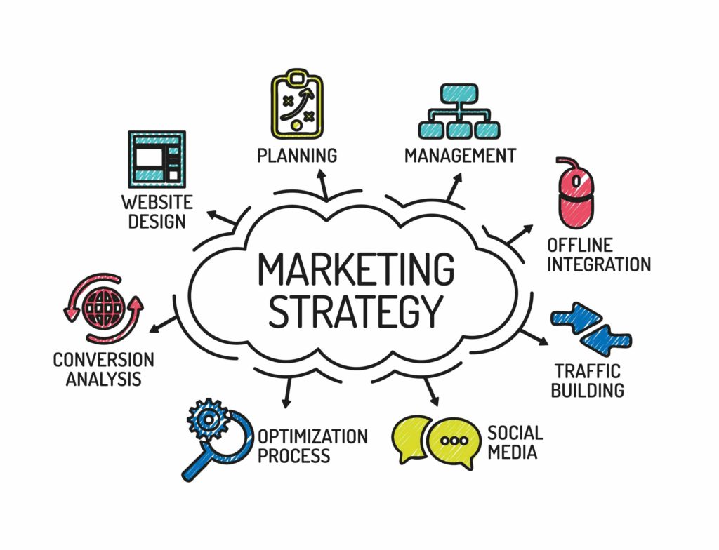
Get FREE Marketing Tips So You Can Grow Your Online Business
Check Out Our Latest Posts
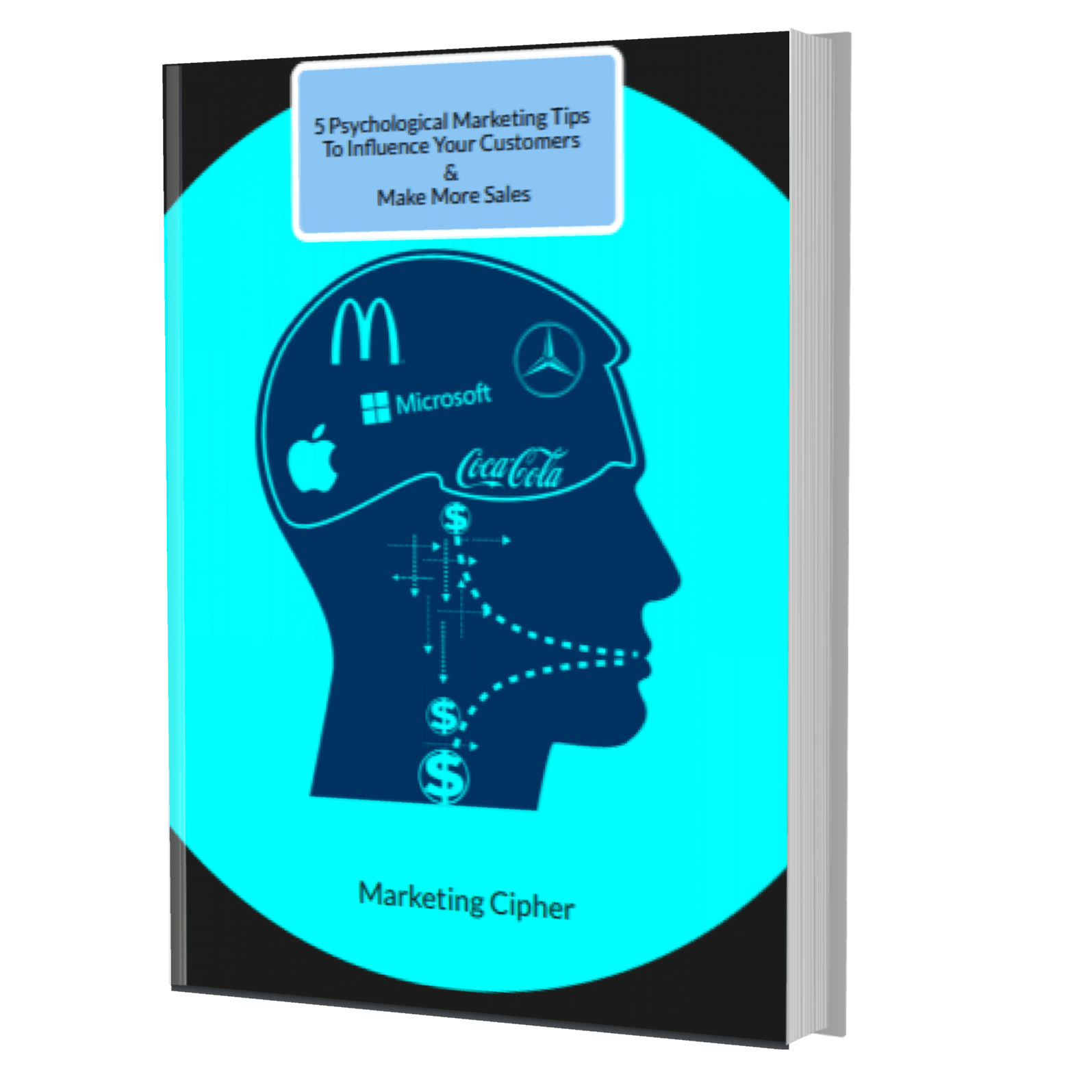
Get Your FREE Gift
"5 Psychological Marketing Tips To Influence Your Customers & Make More Sales"
Download This Free e-book To Learn How To:
Want More Leads, Traffic, & Sales?
Sign Up For Free Tips & Boost Your Results Now!