
Sign Up For Free Tips So You Can:
The Anatomy of a High-Converting Call-to-Action Button
A single button can be the difference between a casual browser and a paying customer. Marketers spend hours crafting headlines and tweaking landing pages, yet the small rectangle that asks visitors to "Buy now" or "Download free" often receives the least attention. That tiny clickable element carries an outsized share of the conversion workload, so it deserves the same strategic thought you give to offer copy or lead magnet design.
For Australian businesses competing in a market where shoppers in Sydney compare prices on their phones while commuting, and regional buyers in places like Cairns or Hobart shop on slower connections, a well-designed call-to-action button can compress the gap between interest and action. Whether you are running campaigns for a Melbourne SaaS startup or a Perth-based e-commerce store, the underlying principles stay remarkably consistent, even if the tactics shift slightly by device, channel and audience.
Colour, contrast and visual weight
Colour carries meaning long before a visitor reads a single word. Red signals energy and urgency, while green feels affirming and safe. Blue tends to communicate trust, which is why so many banks and financial service providers lean on it. The trick is not to copy a competitor's palette but to choose a hue that contrasts sharply with the surrounding layout. A muted grey background with a vibrant orange button will always outperform an orange button floating on a yellow page, because the eye scans for difference, not familiarity.
Brands like Afterpay have shown Australian consumers respond to bold colour choices, and local retailers often borrow from that visual playbook during EOFY sales windows. Test your button colour against the dominant background shade rather than the brand logo, and remember that accessibility matters. Around one in twenty Australians lives with some form of vision impairment, so a contrast ratio of at least 4.5:1 between the button and its surroundings protects both readability and conversions. For more on getting visitors to actually engage with what you are offering, take a look at lead magnet fixes.
Microcopy that nudges action
Words on a button are the last thing standing between hesitation and commitment. Generic phrases like "Submit" or "Click here" leak conversions because they tell the visitor nothing about what they will gain. Strong microcopy instead frames the exchange as personal benefit. "Get my free guide" reads better than "Download", because it centres the reader and makes the offer feel earned rather than pushed.
First-person phrasing tends to lift click-through rates by a meaningful margin. People respond to language that feels like their own internal monologue, not a corporate voice. Pair the verb with a concrete noun so the visitor knows exactly what happens next. If the offer is a checklist, say so. If it is a sample, name it. If you want practical guidance on sharpening the offer that sits behind the button, crafting a stronger email pitch walks through the same idea at a larger scale.
Size, shape and placement on the page
A button can be perfectly written and beautifully coloured, yet fail because nobody can find it. Visual hierarchy dictates that the most important action on a page should be the largest interactive element, with sufficient white space around it so neighbouring links or images do not compete for attention. Rounded corners feel approachable, sharp corners feel transactional, and full-width buttons work well on mobile where thumb travel is the main constraint.
Placement matters as much as shape. Above the fold is essential for cold traffic arriving from ads, while repeat visitors benefit from a button anchored after the section that finally persuades them. Heatmap tools consistently show that buttons placed after pricing tables or after a benefit checklist outperform those tucked into footers. Australian advertisers running geo-targeted Facebook campaigns to Brisbane or Adelaide often discover that local audiences scroll differently than expected, which makes testing the placement on real user sessions far more reliable than guessing.
Creating urgency without sounding desperate
Urgency is a powerful lever, but only when it is genuine. Fake countdown timers and fabricated stock alerts erode trust the moment a savvy shopper notices the timer resets on every page load. Real urgency comes from honest constraints: a sale that genuinely ends Sunday, a bonus that genuinely runs out, a webinar that genuinely has limited seats. The button copy can echo that constraint without overpromising. Phrases like "Claim before Friday" or "Save your seat" feel grounded, while "Hurry! Only 3 left!" can read as manipulative when it appears on a page selling a digital product with unlimited inventory.
The end of financial year in Australia is a natural urgency moment that local marketers use well, and Boxing Day sales produce similar spikes. Tie your call-to-action to a real deadline that exists in your customer's world, and the button becomes a prompt rather than a sales gimmick.
Mobile-first design and the Australian tap habit
Mobile devices account for the majority of web traffic in Australia, and that share keeps climbing year on year. A button that looks elegant on a 27-inch monitor can become a thumb-strain nightmare on a phone. Apple's Human Interface Guidelines suggest a minimum tap target of 44 by 44 points, and Google recommends roughly 48 density-independent pixels, both of which translate well to Android handsets sold across Telstra, Optus and Vodafone networks.
Spacing between adjacent buttons matters just as much as the size of the button itself, because accidental taps cost you both the click and the trust. Test on real devices rather than just resizing a browser window, because viewport resizing does not replicate touch physics or thumb reach. For Australian marketers targeting commuters in Sydney or students in Melbourne, designing for the tap first will lift conversions more reliably than any colour swap or copy rewrite.
Want the full playbook behind buttons, offers and emails that turn browsers into buyers? Grab the free Marketing Cipher ebook when you join the newsletter, and receive weekly strategies straight to your inbox.
Expert Marketing Tips & Tricks
We will share with you the latest tips and tricks from proven marketing experts:
- Dominate your target market
- Write powerful sales copy that converts
- Learn traffic secrets to attract unlimited leads
- Create Irresistible offers
- Grow your email list
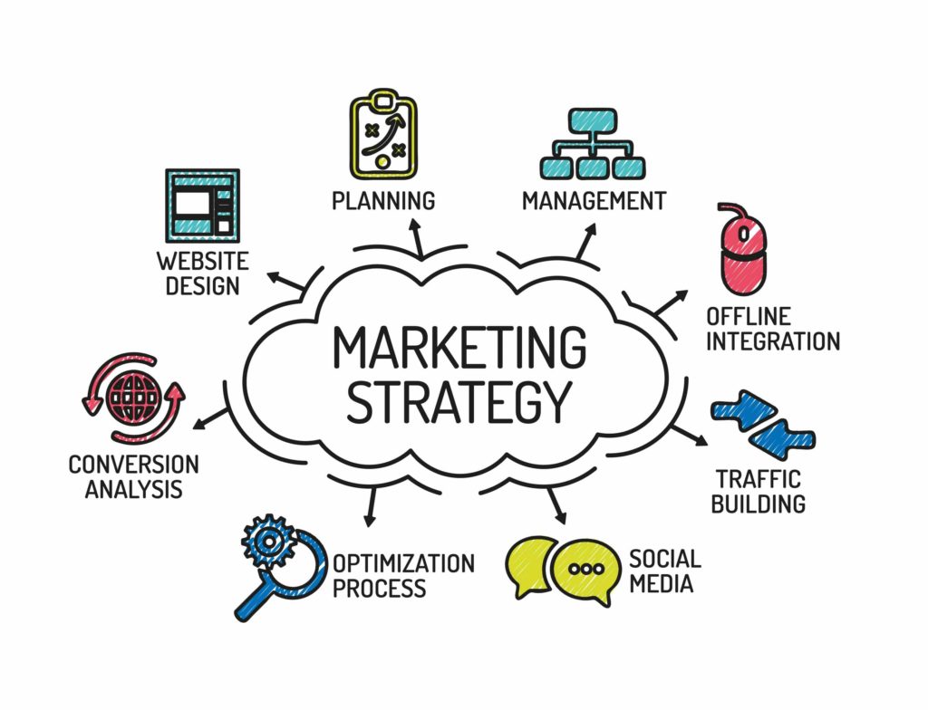
Get FREE Marketing Tips So You Can Grow Your Online Business
Check Out Our Latest Posts
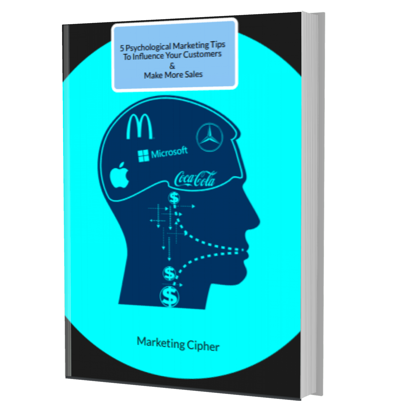
Get Your FREE Gift
"5 Psychological Marketing Tips To Influence Your Customers & Make More Sales"
Download This Free e-book To Learn How To:
Want More Leads, Traffic, & Sales?
Sign Up For Free Tips & Boost Your Results Now!